Things we’ve built
Real products for real people. Every project here started as an idea — we turned it into something that works.
Saporini Italiano
Full digital transformation — chosen by an American restaurant owner
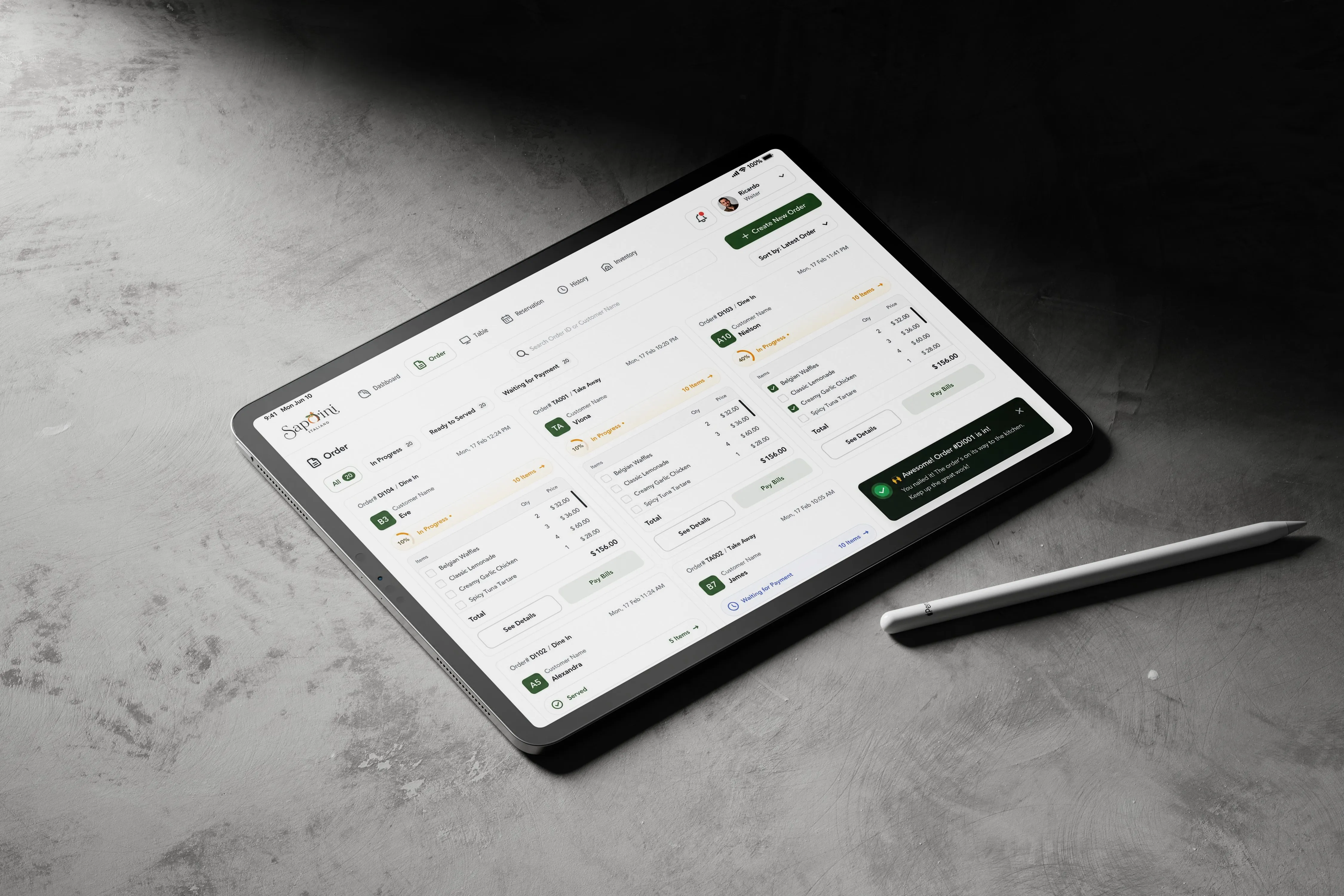
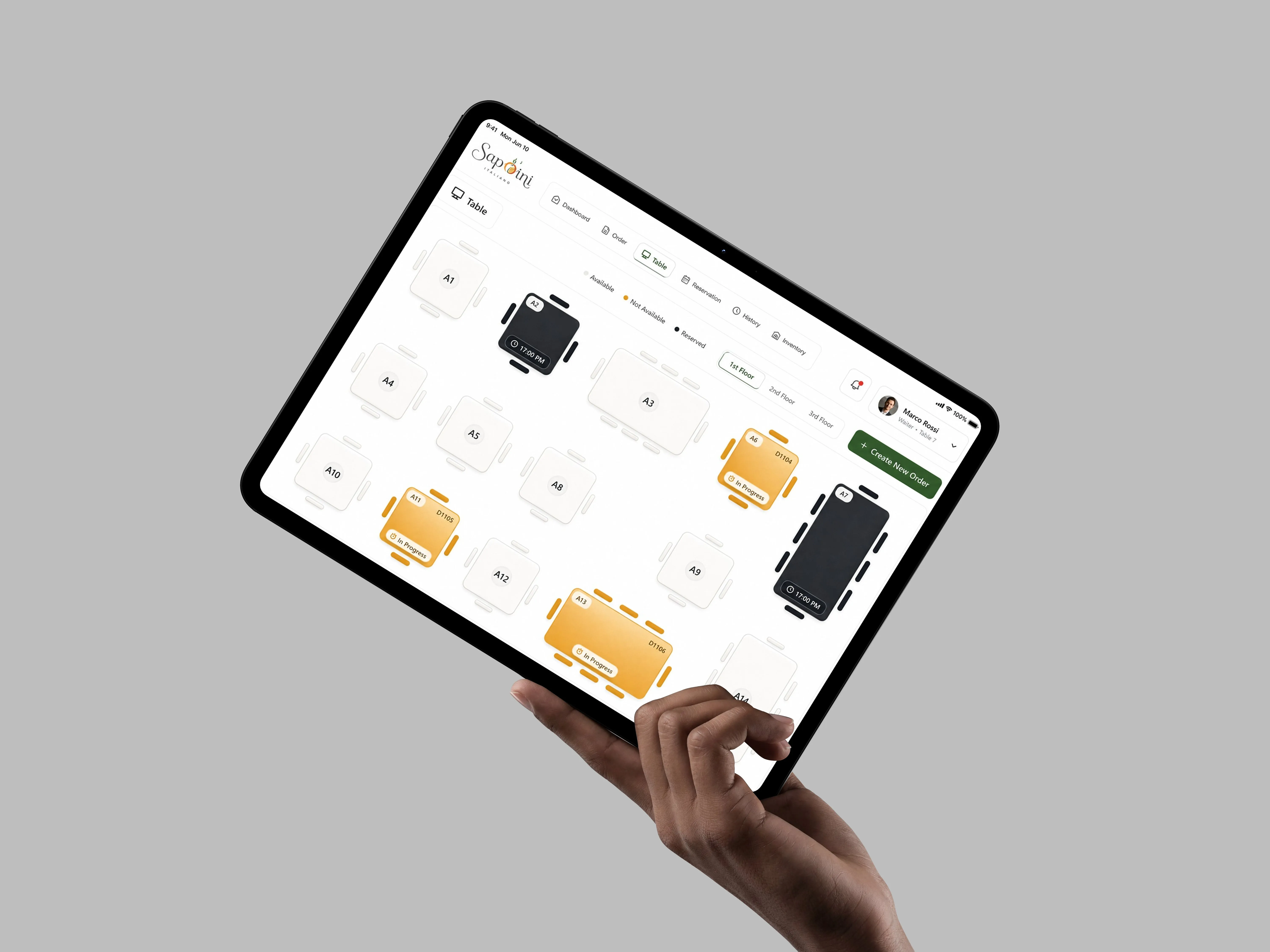
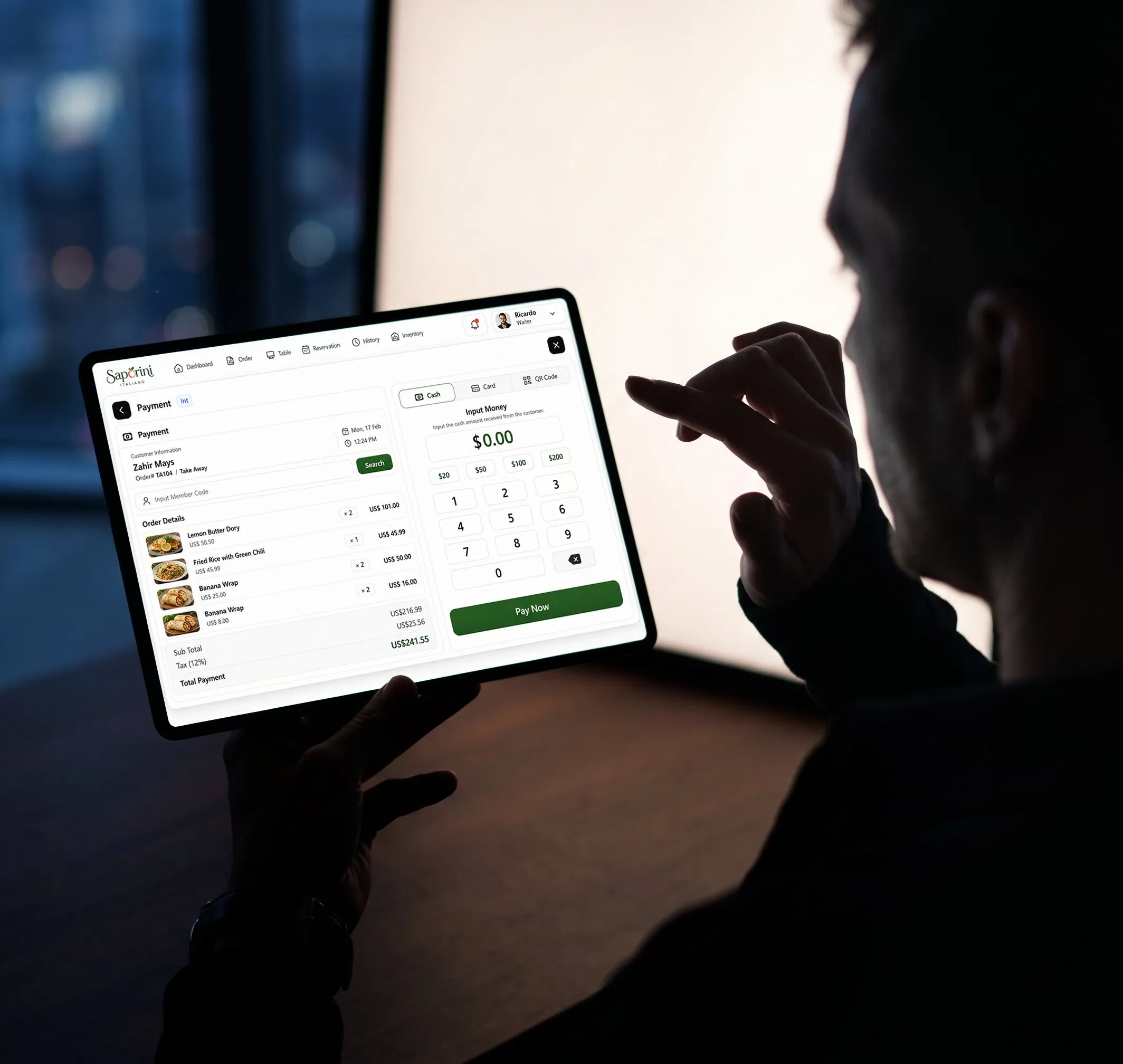
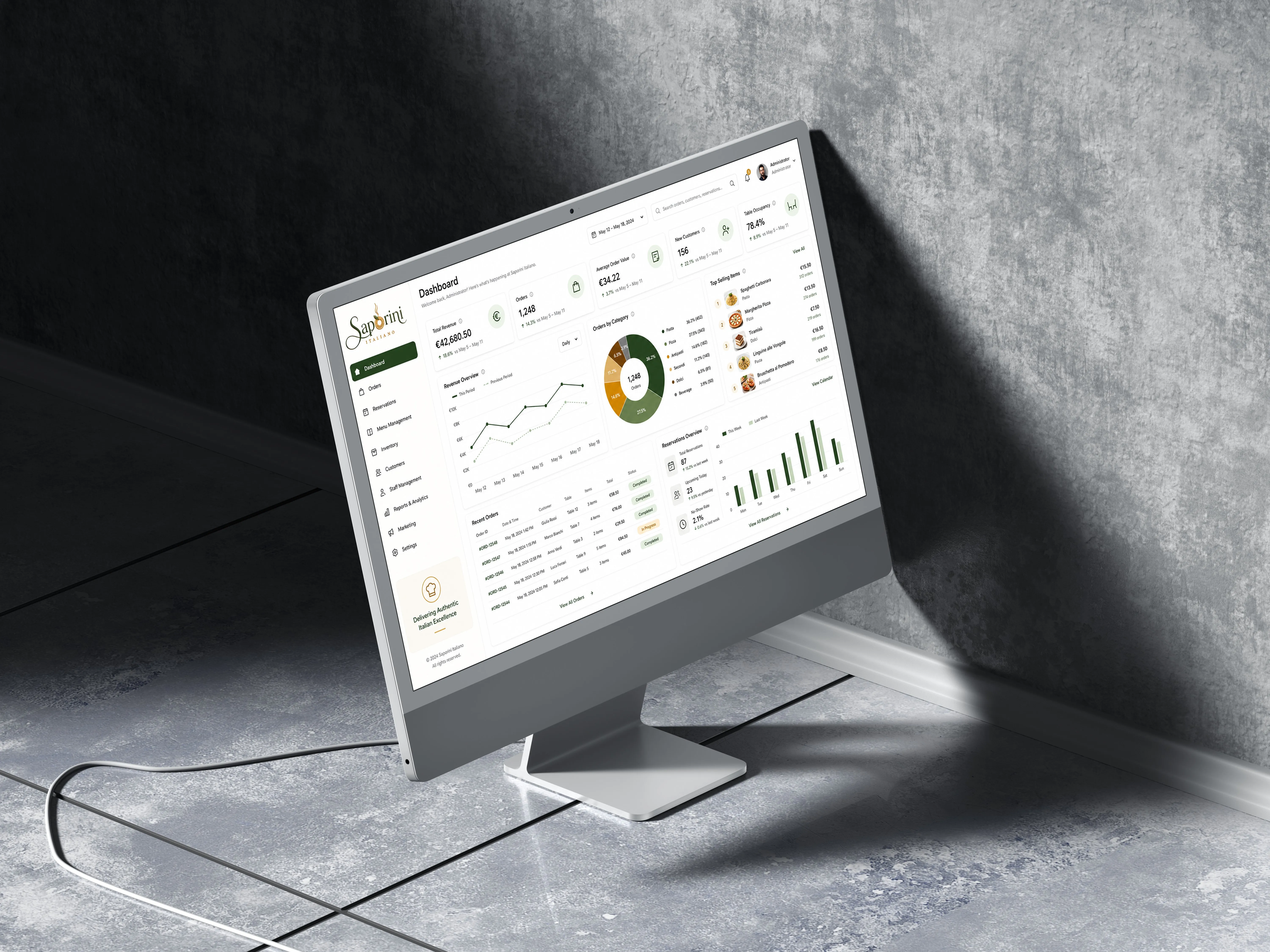
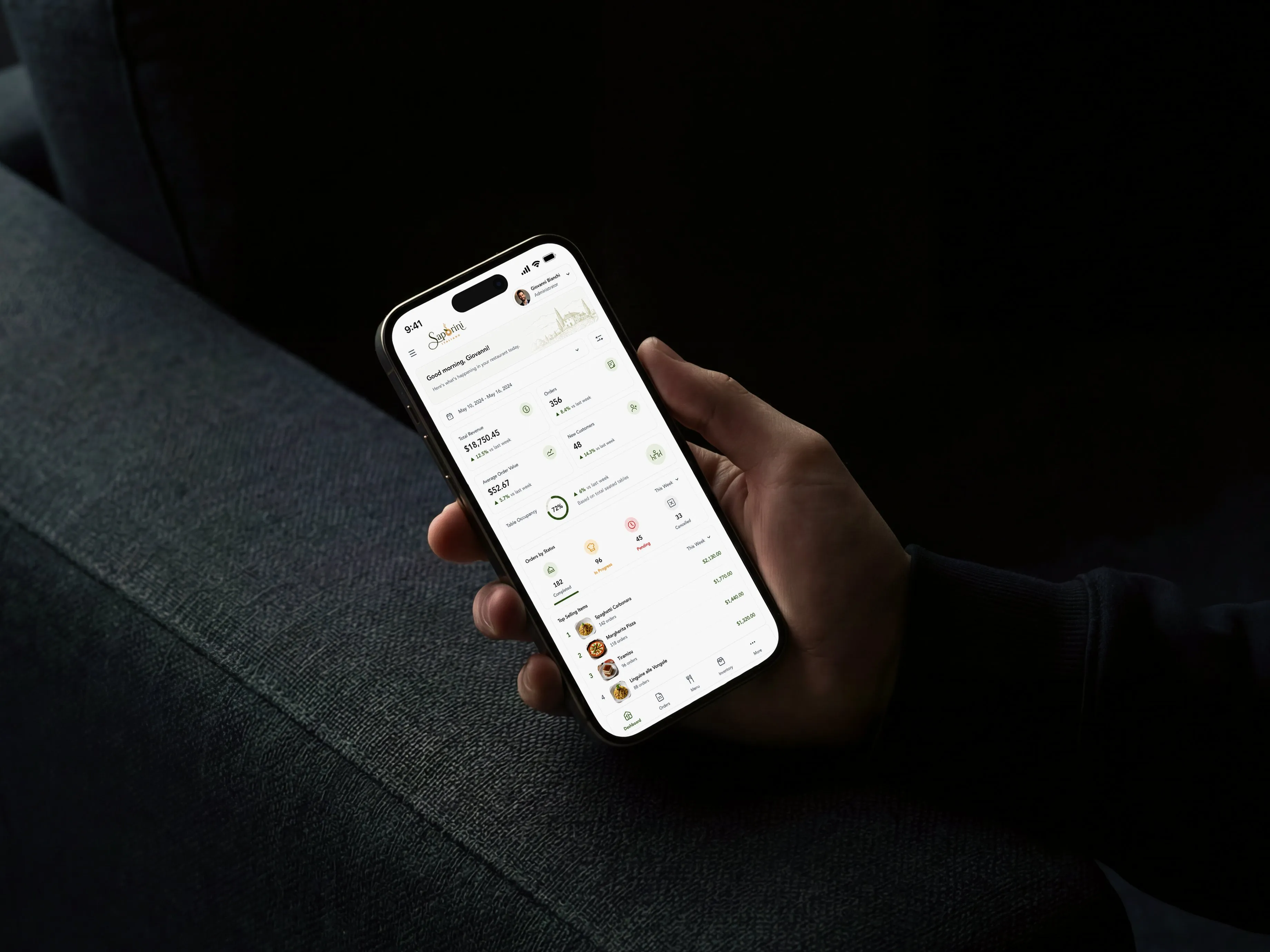
An American restaurant owner approached us to build the entire digital infrastructure for Saporini Italiano from the ground up. Not just a POS — a complete, connected system covering every part of how the restaurant operates. They chose us because we don’t just deliver software, we understand how a real business works and we build around it.
The system covers four pillars: online ordering so guests can place orders before they even walk in, tablet ordering at every table so guests order directly from their seat without waiting for staff, a full POS and Kitchen Display System so the kitchen always knows what’s coming in real time, and a complete inventory and stock management system so the owner always knows what’s in the magazine, what’s running low, and what needs to be ordered.
The project is actively in development and already running in the restaurant. The client is highly satisfied with the direction — the system is already changing how the restaurant operates and the investor sees exactly the transformation they were looking for when they chose us.
What the system covers
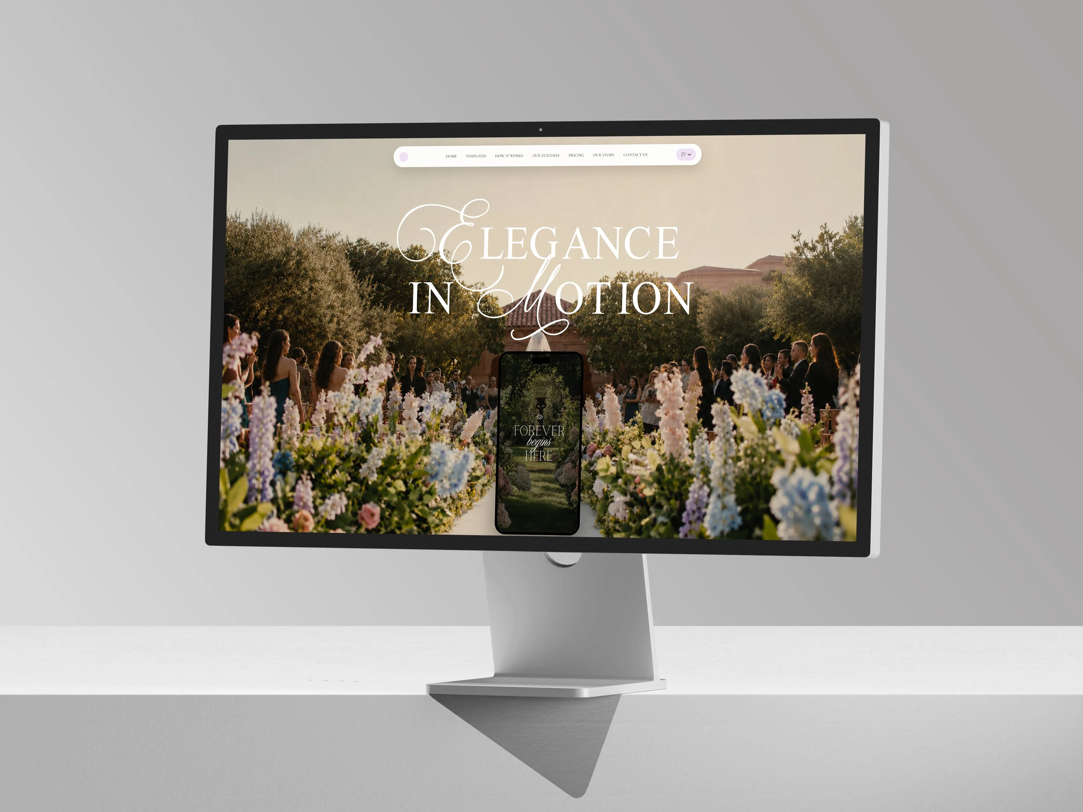
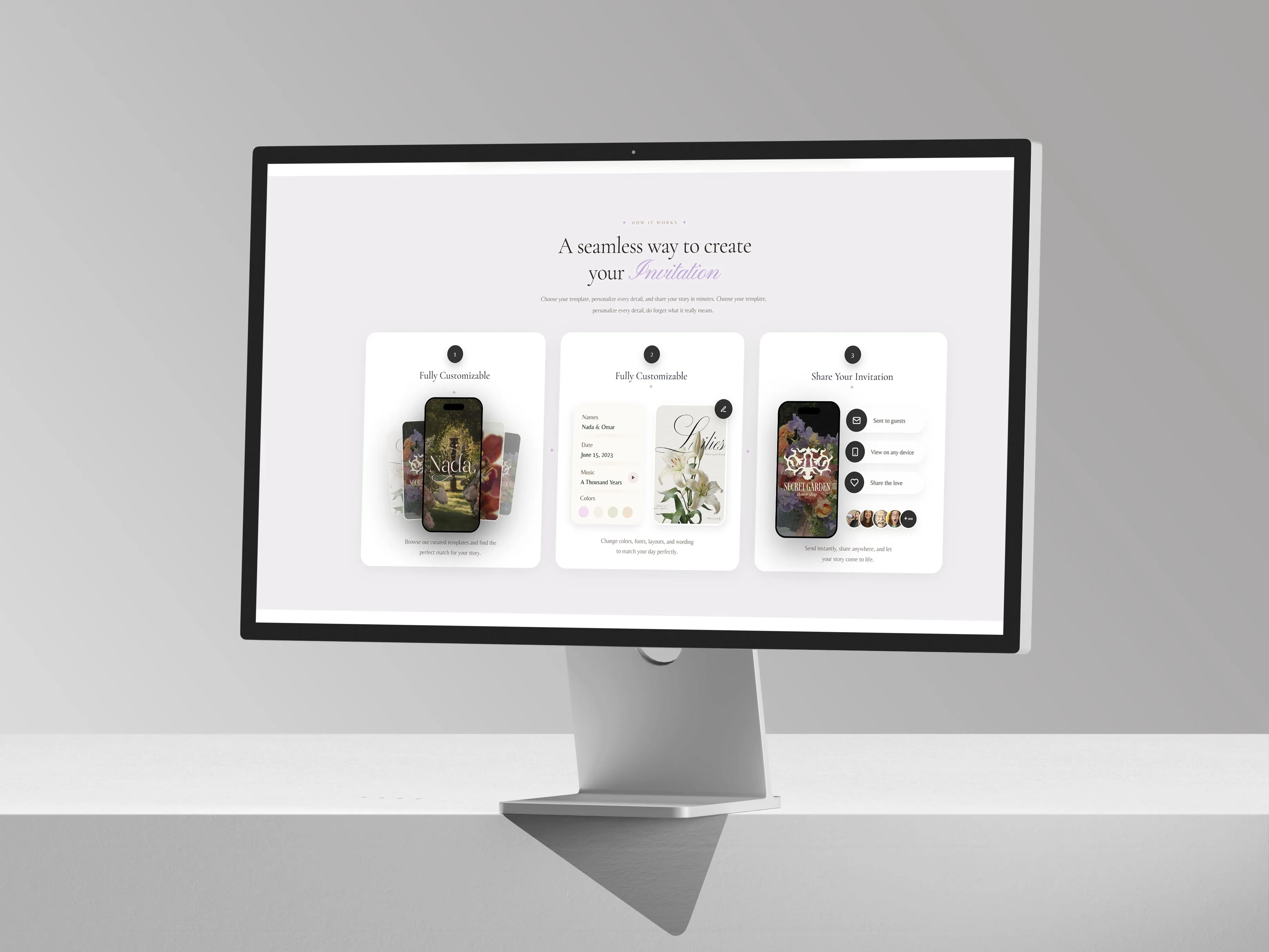
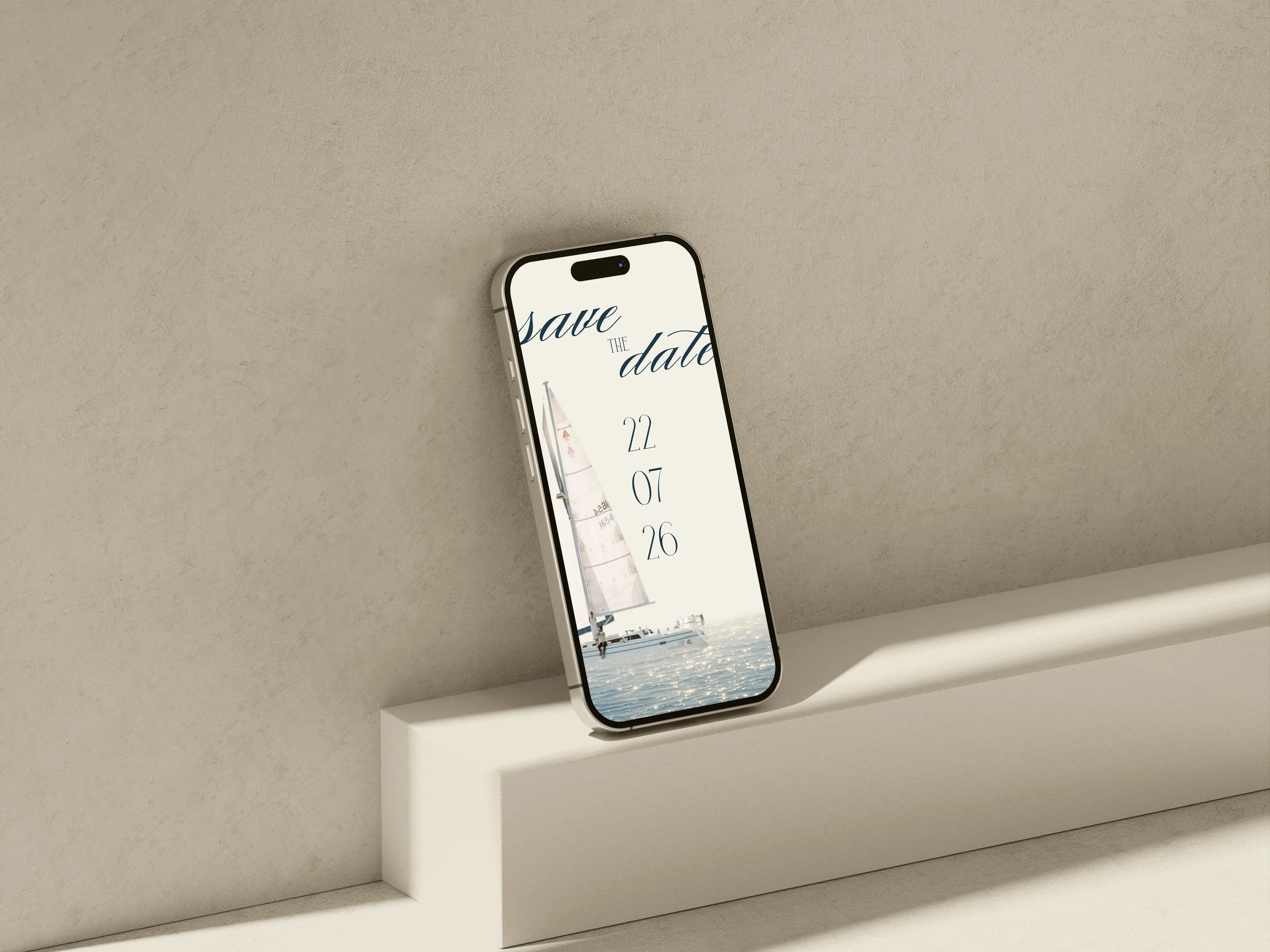
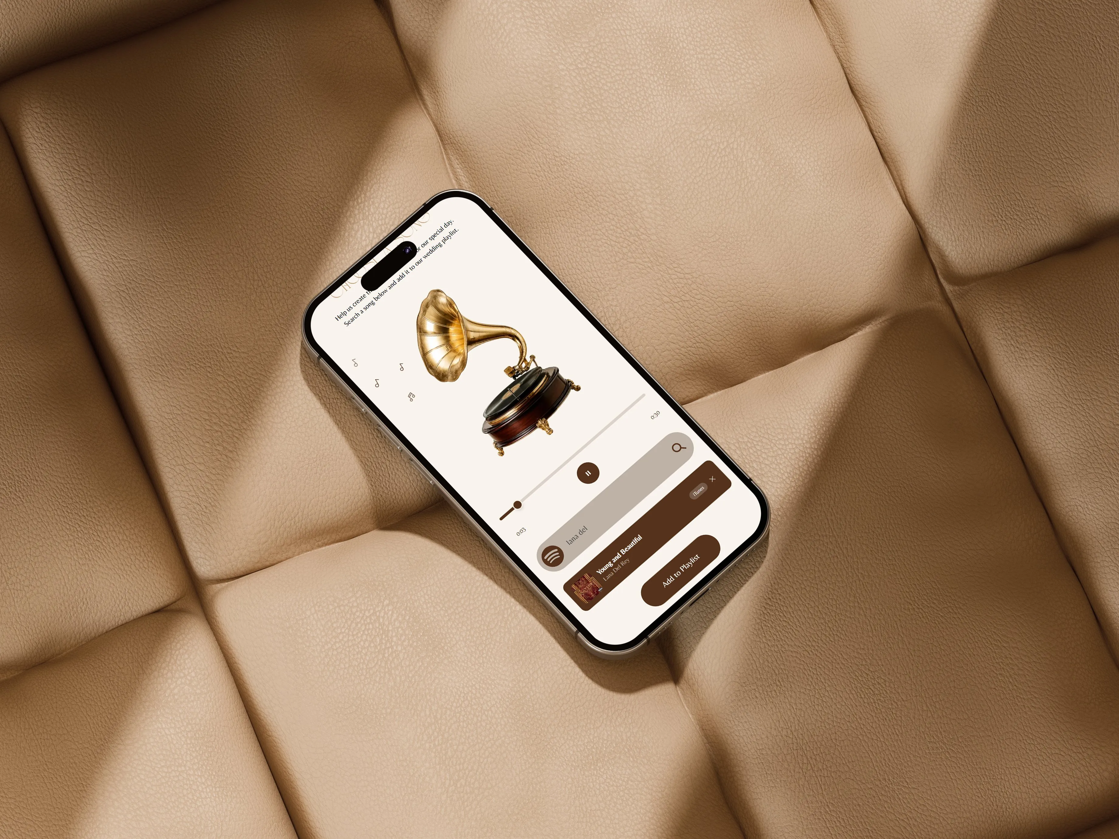
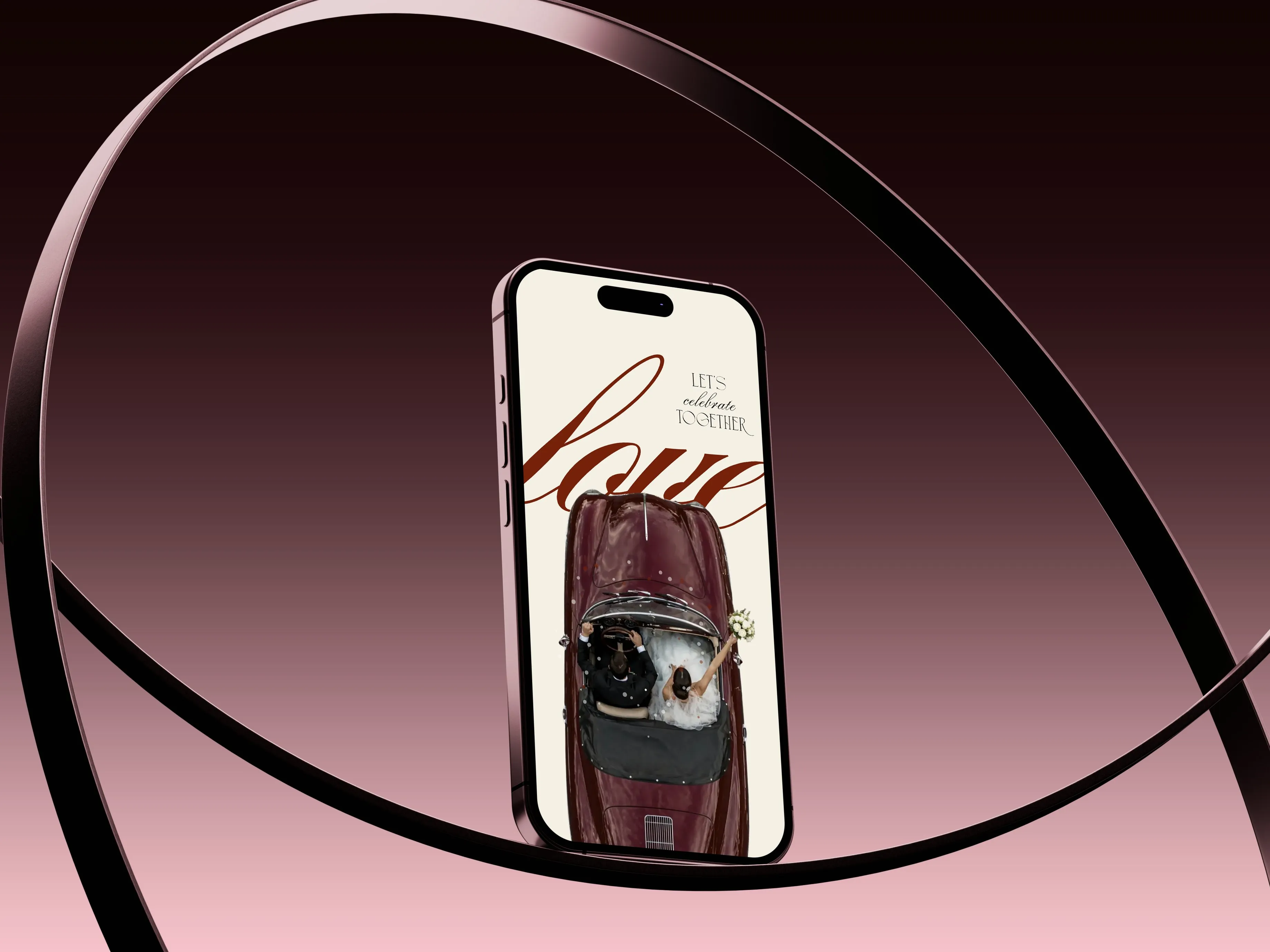
A German entrepreneur came to us with a clear vision: couples should be able to create stunning wedding invitations online without hiring a designer or dealing with print. She wanted a platform where anyone could pick a template, fill in their details, and have something beautiful ready to share in minutes. We built it from scratch, end to end.
Before the Bells lets couples choose from several curated templates across three styles — Luxury, Elegant, and Minimal — with more being added over time. Every invitation is fully personalised to the couple: Each invitation includes a live RSVP system, smart venue map, photo gallery, event timeline, and instant guest management. One shareable link contains everything. Changes go live instantly, no reprinting, no resending.
The platform launched successfully and is already serving couples. Off the back of this, the client is now planning to expand into a full event shop — covering birthdays, baby showers, gender reveals, and more. What started as a wedding invitation tool is turning into a full digital event brand. We’re part of that journey.
What the platform includes
BOA
Visual identity for a handmade pottery shop
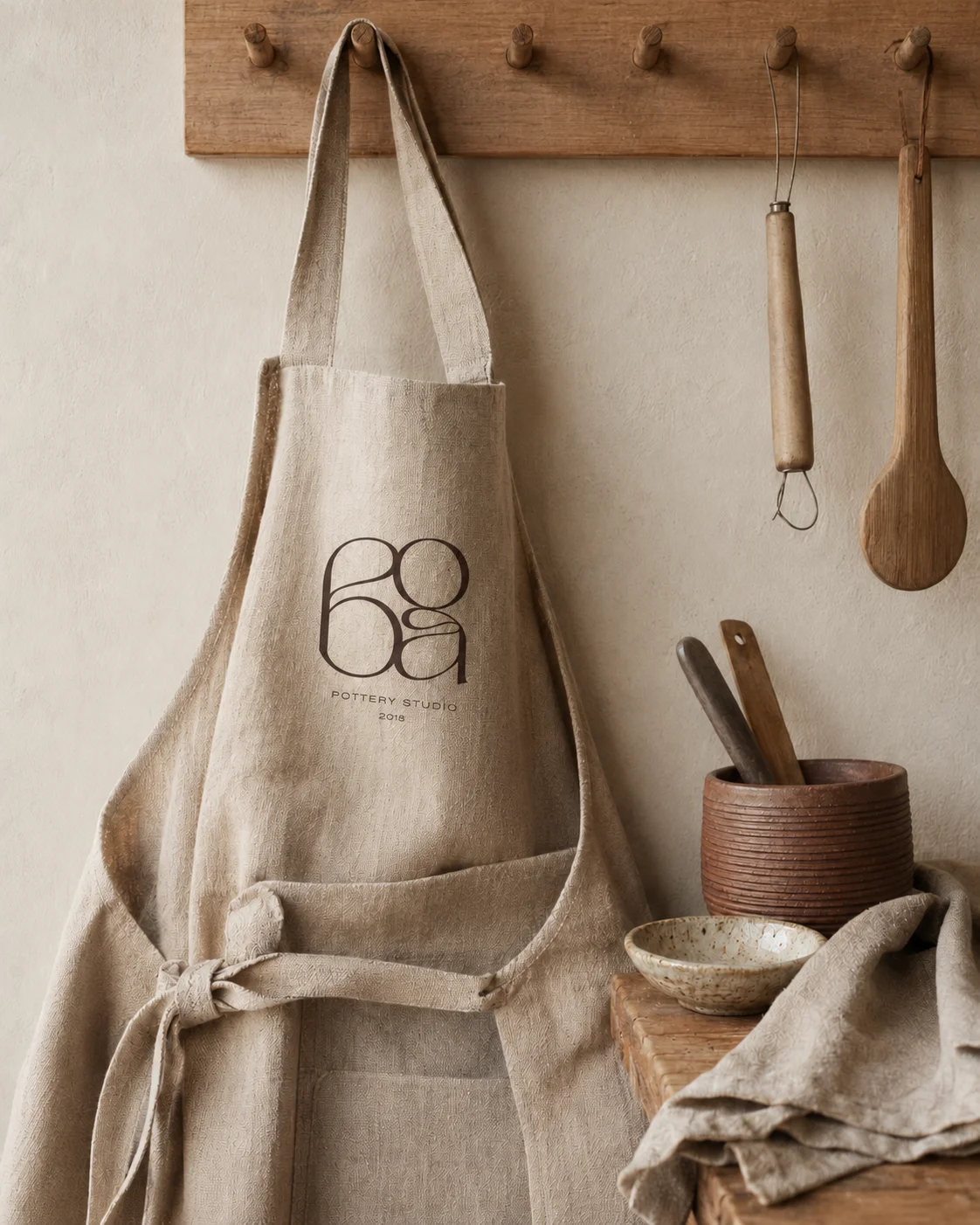
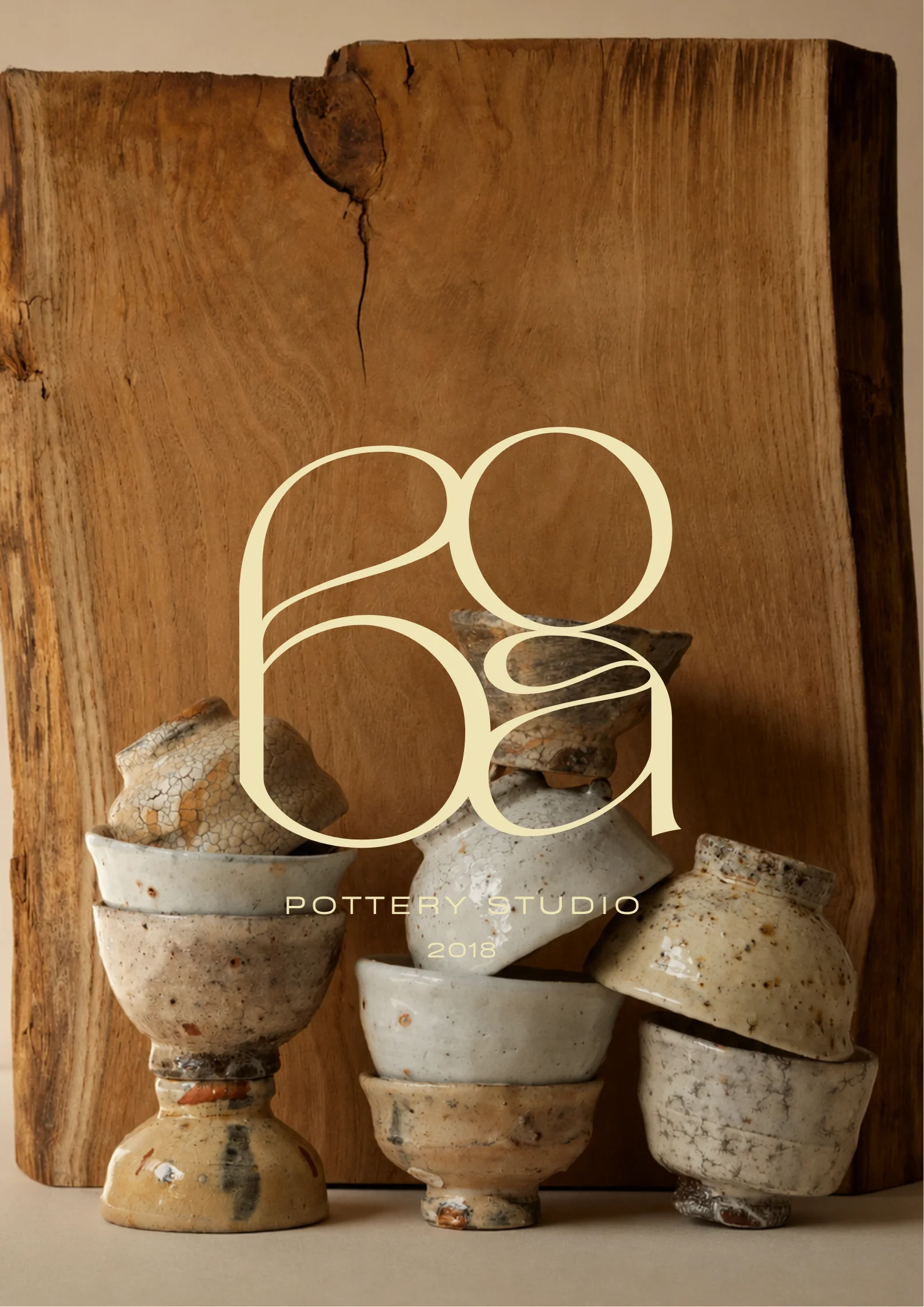
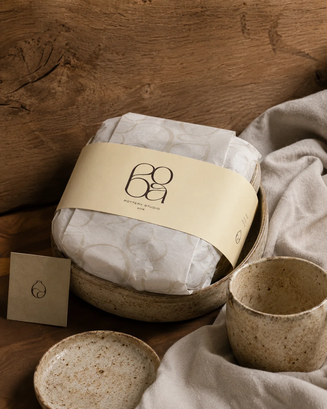
Pottery is one of the oldest crafts, but that doesn’t mean the brand has to look old. BOA is a pottery shop that takes handmade craft seriously — the owner wanted a brand that communicated that quality clearly. Not rustic, not artsy for the sake of it. Clean, grounded, and modern, with the kind of confidence that earns trust.
We built a brand identity that balances the warmth of handmade work with sharp, modern design. The logo is minimal and refined. The color system uses earthy tones with enough contrast to feel premium. We also extended the identity into POS branding, so the in-store experience matches the visual standard of the brand as a whole.
A brand that makes the craft feel valuable before someone even holds the product. BOA now operates with a visual identity that works at every customer touchpoint — from the storefront to the receipt.
What we delivered
FORE
Visual identity for a premium flower shop
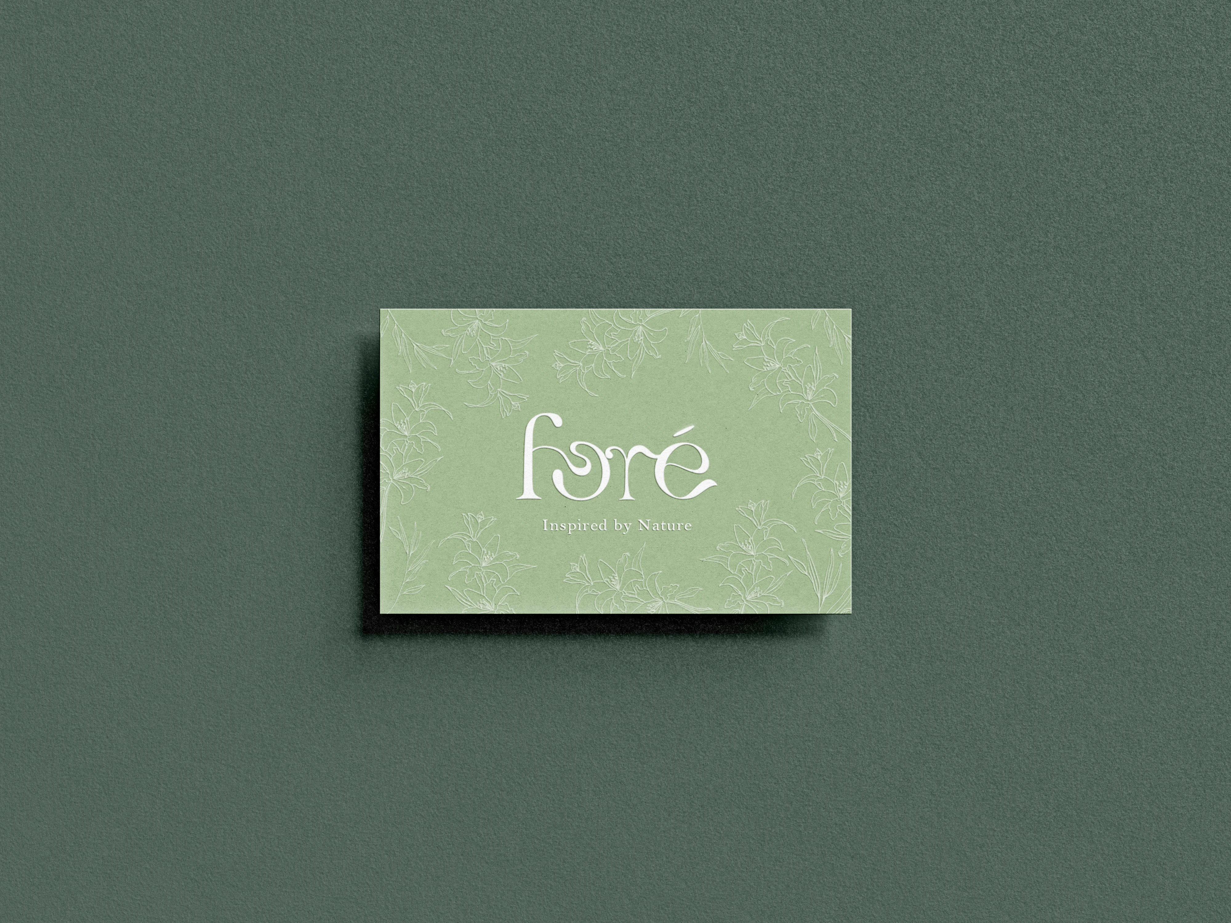
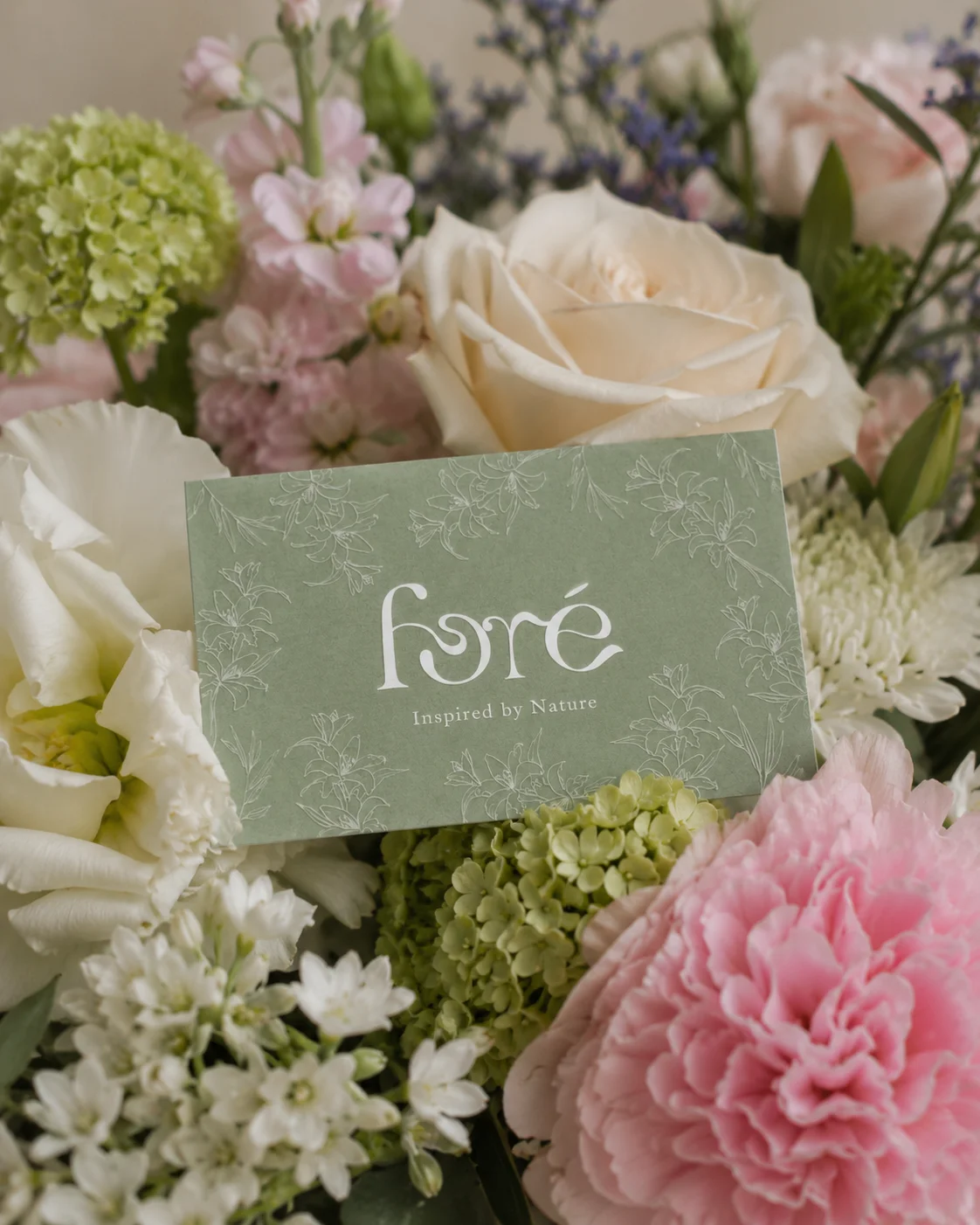
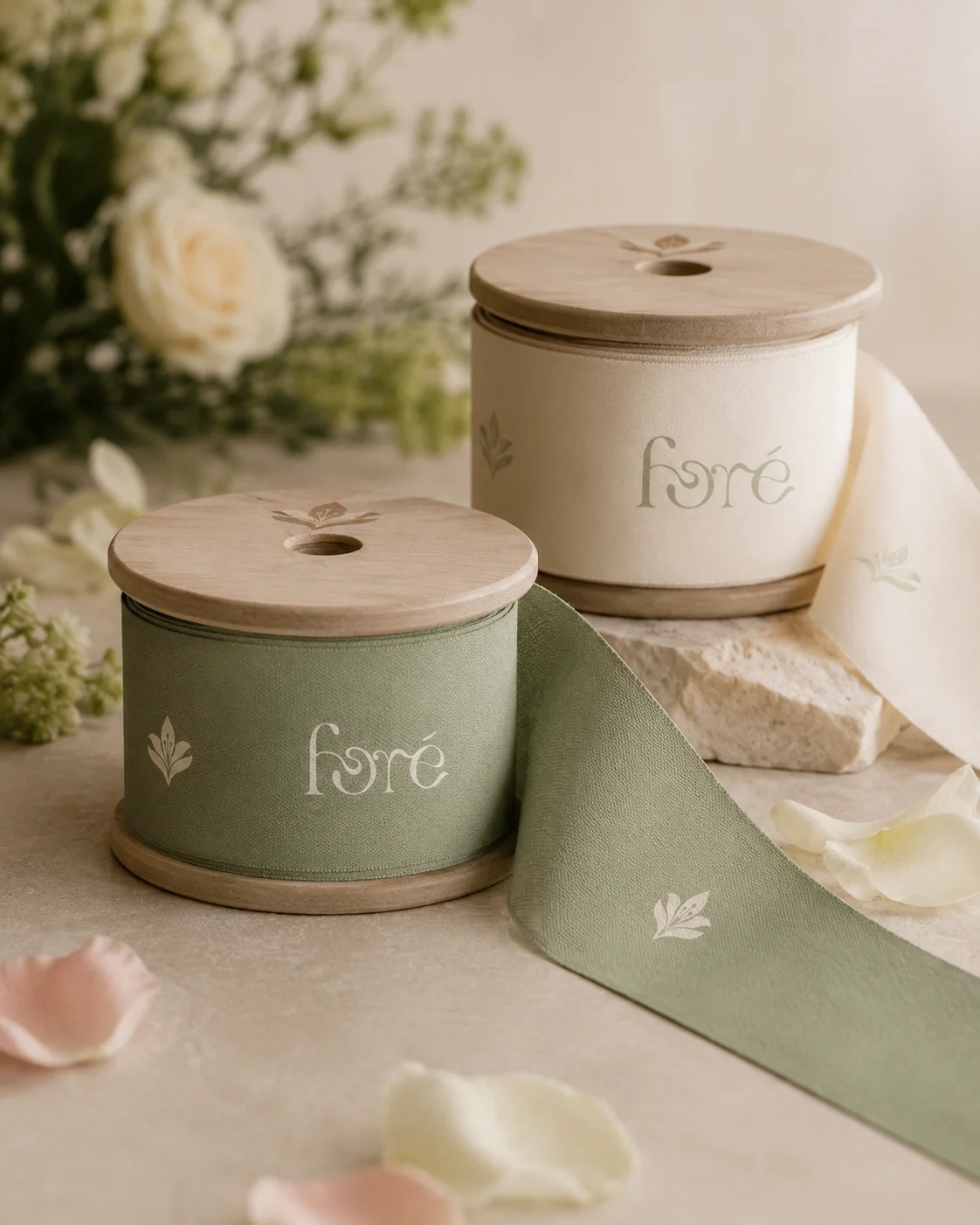
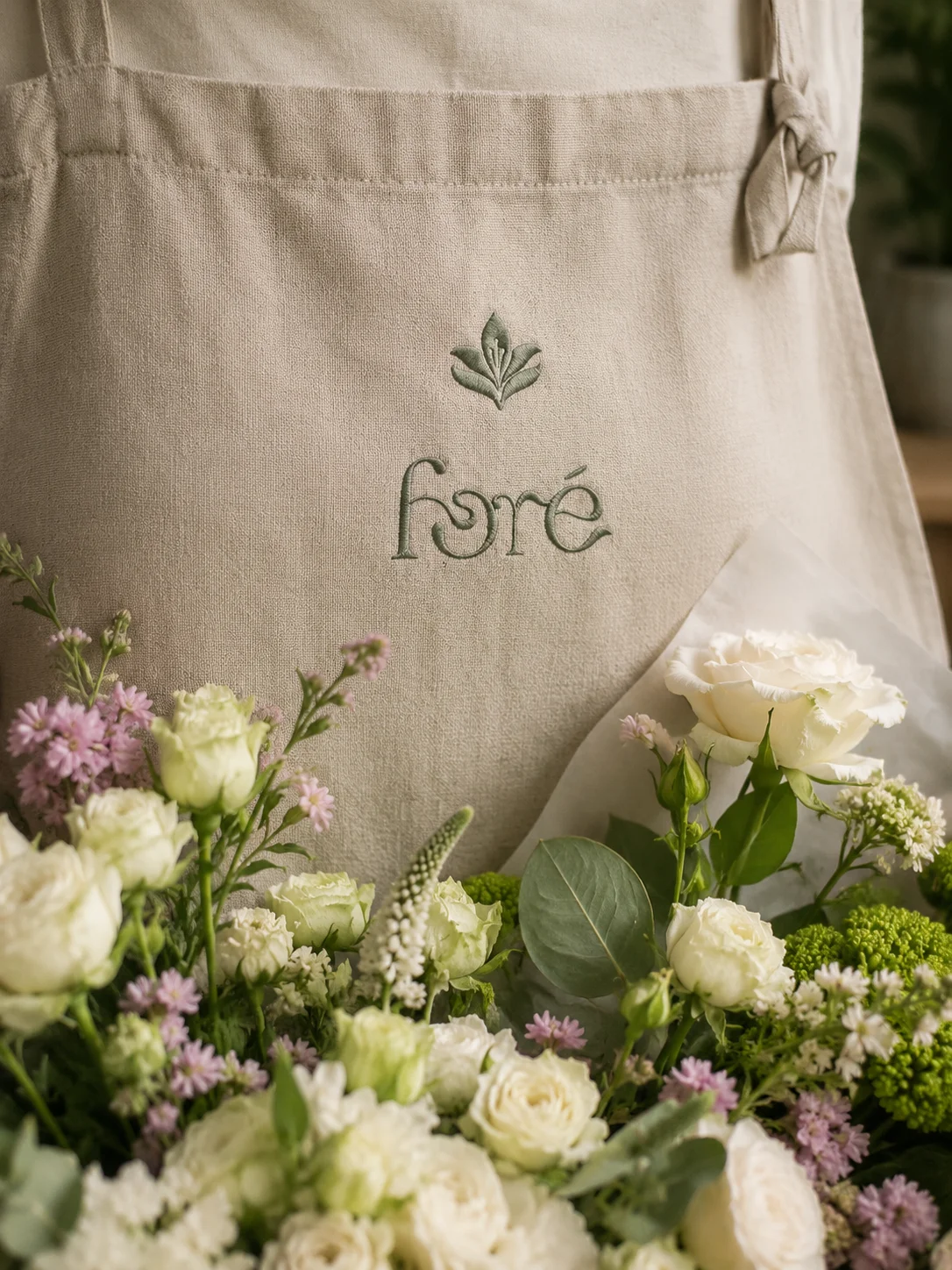
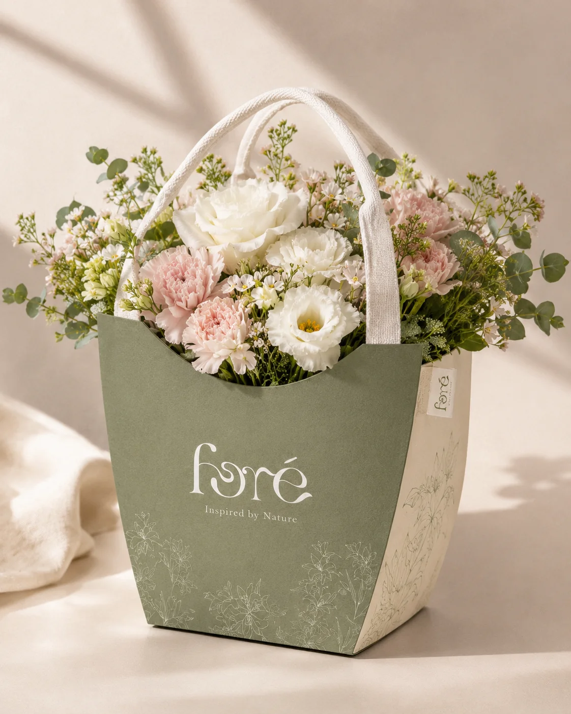
A flower shop needed a brand that felt alive — something that said fresh, premium, and natural without relying on the usual clichés. FORE needed to stand out in a market full of script fonts and pink palettes. The goal was elegant restraint: a brand that lets the flowers speak and only adds to their quality.
We built a full visual identity system grounded in natural tones and clean typography. The logo mark is minimal but distinctive. The color palette draws from botanical greens and warm neutrals, giving the brand versatility across print and digital. Business cards, stationery, and brand applications all carry the same quiet confidence.
A brand that feels considered — the kind that makes customers trust the quality before they even see the product. FORE now has a visual language it can grow with, from in-store materials to social media to packaging.